Brand Identity · Design System · 2025
Making a 100-year-old tool feel like an object worth owning.
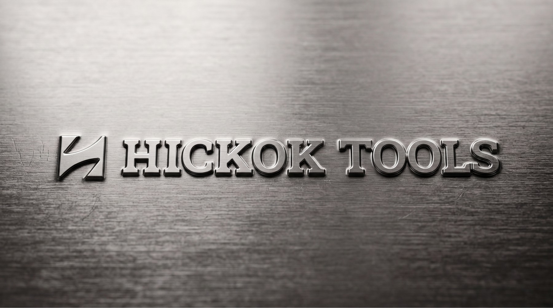
Hickok Tools has been forging professional pruning shears in East Wenatchee, Washington since 1928. The steel was the best in its category. The brand looked like everything else on the hardware shelf.
01 · The problem
Best-in-class steel, priced like a commodity.
Growers who use Hickok loppers talk about them the way other people talk about a good knife: one-piece forged steel, sharpened for a lifetime, owned once and never replaced. The product was never the issue.
The brand was. Generic hardware typography, no consistent color, packaging that competed on price instead of on craft. A tool that costs three times the shelf average was asking to be judged on the same shelf, by the same rules.
The brief from Superior Fruit Equipment was direct: make it read as a professional instrument, not as a hardware SKU.
02 · The idea
Blue is earned.
Luxury tool brands don't shout. They use one signal, consistently, until the signal itself becomes the status. Rolex has a crown. Louboutin has a red sole. Hickok had a blue that already existed on the handles and had never been treated as equity.
So the strategy became a discipline rather than a decoration: Hickok Blue appears rarely and always on purpose. On the steel, on the seal, on one word per headline. If you notice the blue, it means something is being said.
The steel is the jewel
Every application leads with the forged edge and the numbers behind it: 60 HRC, one-piece, 1928. Specification as seduction.
Restraint over volume
Vast space, thin rules, small type. Nothing on the page competes with the object being sold.
One accent, defended
Blue is roughly one percent of any surface. Its scarcity is what makes it read as status instead of decoration.
03 · Where I was wrong
My first typographic instinct made the brand weaker.
I opened with refined lowercase serifs. Editorial, quiet, expensive-looking in isolation. Then I put it on a lopper, on a hang tag, on a dealer sign, and it fell apart. It read delicate. A tool a professional trusts with a full day of pruning cannot whisper.
What changed my mind was looking at how heritage brands actually carry authority: uppercase, structure, weight, generous letterspacing. So the system moved to an all-caps slab, and the two hard Ks in HICKOK turned from an awkwardness into the strongest character pair in the wordmark.
04 · The system
A monogram forged from the product itself.
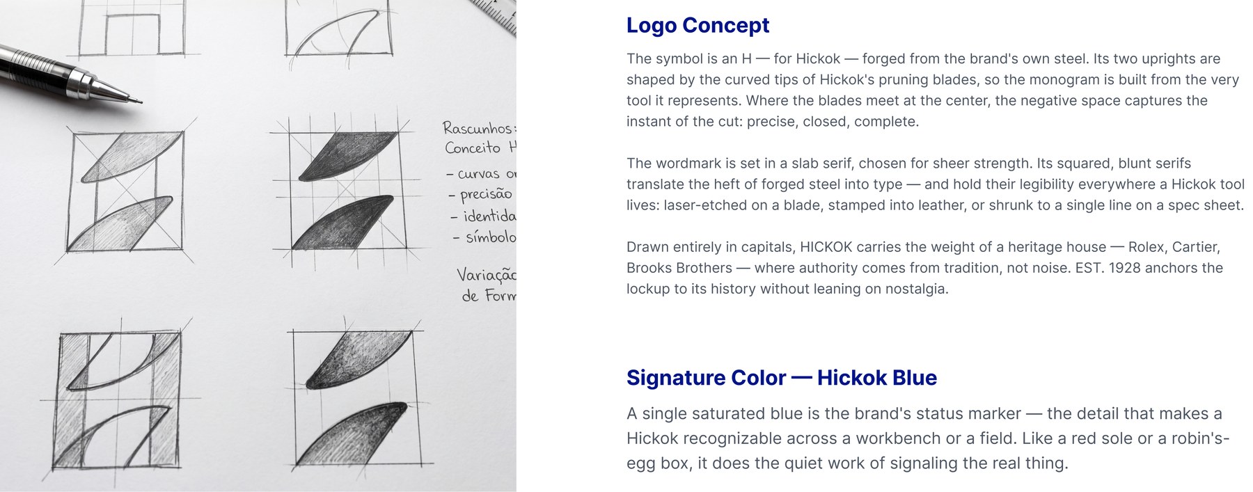
The symbol is not an abstract mark applied to a tool. It is the tool: the two uprights of the H are the curved bypass tips of a Hickok blade, mirrored. It survives at 16 pixels on a favicon and at two meters on a dealer sign, and it works stamped into metal, which is where it actually lives.
Around it sits a full system rather than a logo file: a defined color hierarchy, three typefaces with distinct jobs, and a component library so every future piece looks like it came from the same house.
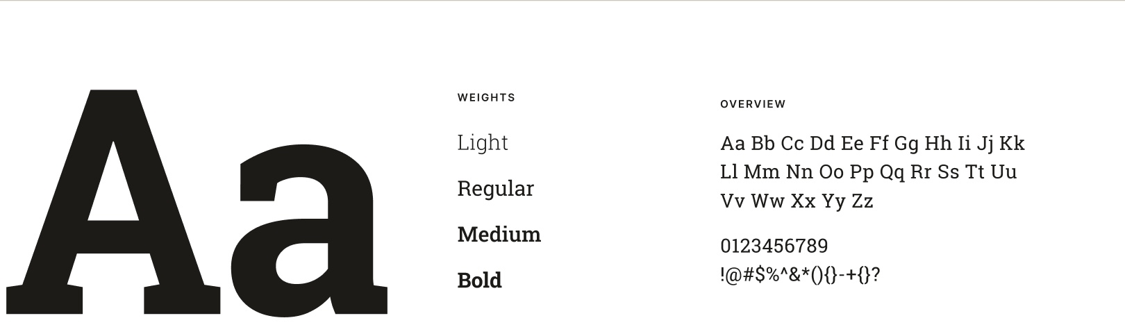
- Display
- Roboto Slab: heritage and authority, the voice of the brand
- Text
- Inter: neutral, legible, gets out of the way
- Specification
- IBM Plex Mono: part numbers, hardness, dimensions
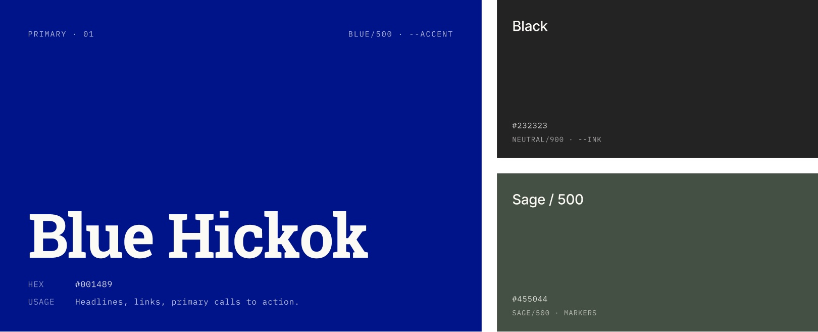
- Primary
- Blue Hickok #001489: headlines, seals, one emphasis word
- Base
- Black #232323 and white: the ground everything sits on
- Secondary
- Sage #455044: a whisper accent for functional cues only
05 · In the field
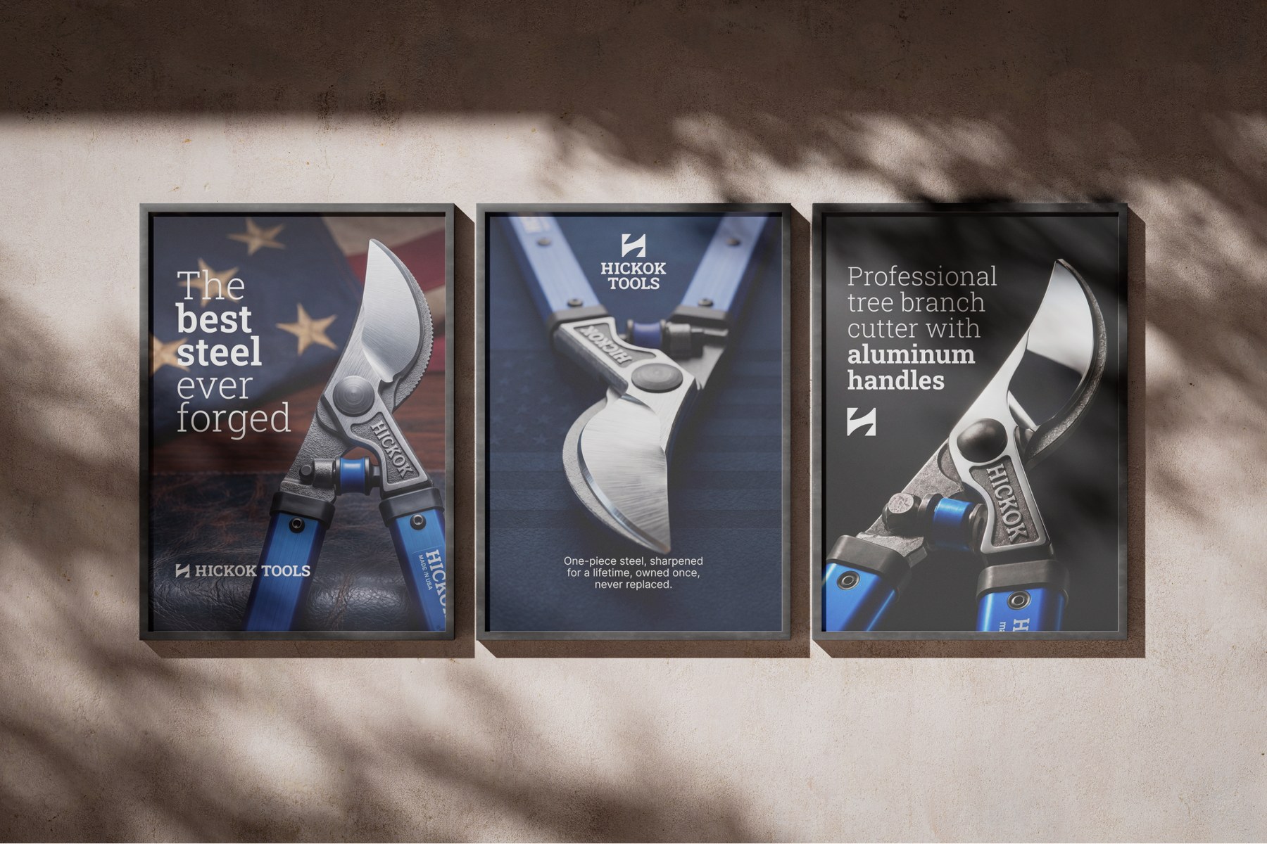
The campaign sells the steel, not the discount.
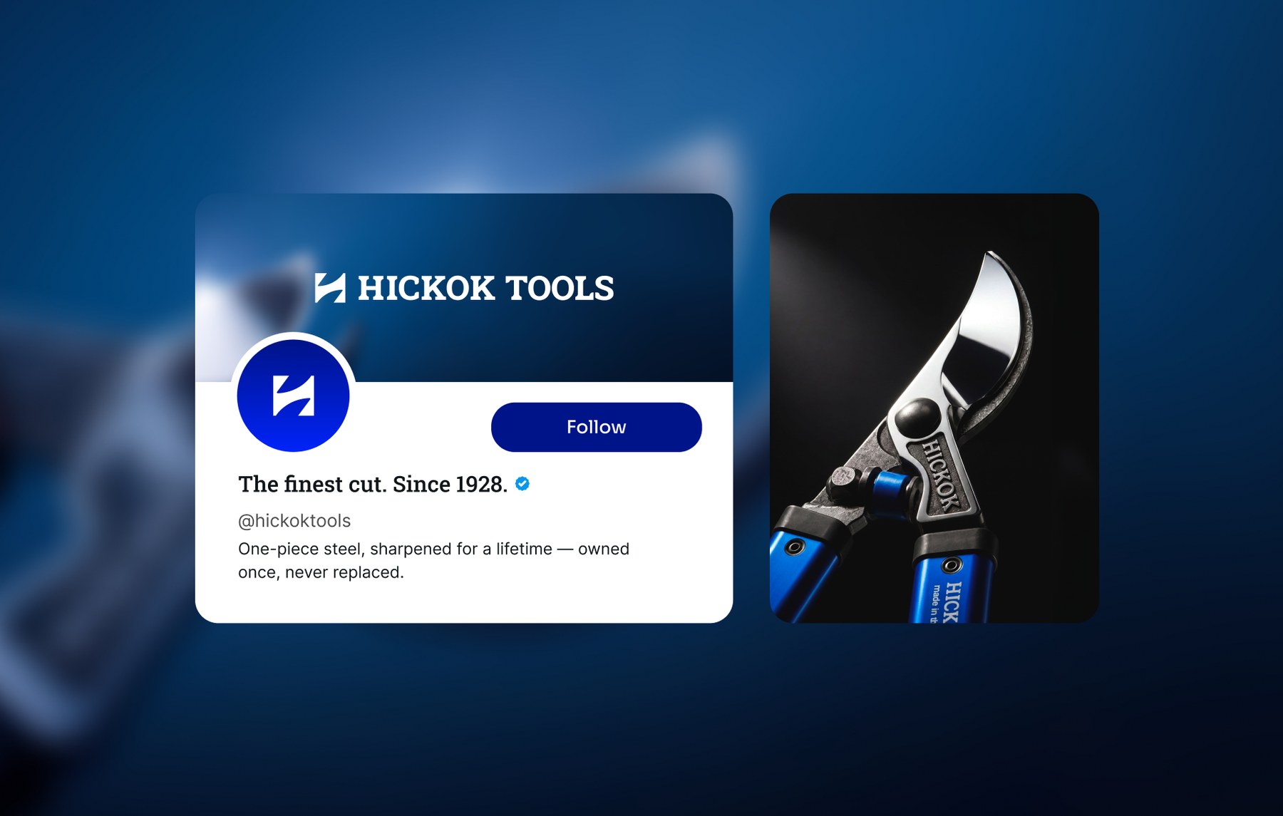
Print and social lead with a macro of the forged edge and a single sentence. No badges, no percentage off, no stars. The line that anchored the whole campaign came from a grower describing the product: the best steel ever forged.
06 · Outcome
One language, from the stamp on the blade to the shelf.
Hickok now has a brand that matches the product it has been making since 1928: a defined symbol and lockup family, a color hierarchy with rules about restraint, a typographic system with three clear jobs, and campaign art direction that treats the steel as the hero.
The brand no longer asks to be compared on price. It asks to be compared on the edge.